


Website Analysis

Coldplay's website has a variety of colours on it however it still has the dark mystic feel that most alternative rock and indie rock websites have. this is due to the background which has a chalk board effect. This catches the eye of the audience as it makes them intrigued to look at the colourful sections therefore the messages that the group are trying to convey are done so in a fun way. The images all contain a burst of colour which is included in the logo of the album and the logo of Coldplay.


Coldplay Website
Logo- the logo for Coldplay is also their album cover image. The logo consists of a geometric shape that has an ombre effect of bright vibrant colours which are red, pink, yellow, green, blue and purple. The colours are used for the title as well which is the name of the tour 'Head full of dreams' with the same ombre effect. The name of the band is placed in the left hand corner which is intriguing as your eye is not drawn to this instantly it is drawn into the logo which is placed directly in the middle which goes against the conventions of a typical website.

In the centre of the home page there are multiple images which are all of the same size. these images consist of a link to the most recent tour date and tours that fall on a celebration such as the New Years Eve show. They also have merchandise advertised and important events that Coldplay have attended or been a part of such as the link to watch them on the Graham Norton show. This makes the audience intrigued as to what they can find out for the page and allows the fans to identify the key aspects o the band.

The navigation bar for this website is also something that is very intriguing for the audience. it is something that would catch the audiences attention as each option has an image to the left of it which follows the ombre effect for the logo and the title this adds consistency to the page. The symbols for each page also make the audience more intrigued to find out what each one means.
there is also a variety of options that the user can click on such as the news, tours, musics, videos, timeline, store and allows the user to sign up to the page in order to find out more things they can see and offers they may get on the website for the tours.


An example of how the pages are laid out is shown in the image to the left. Each page has a tabled effect where they have multiple images placed on top of each other. the images catch the audience attention and makes them want to click on them in order to find out more. the videos page has all of the music videos that Coldplay have made which is also another way for the site to entice the audience in and make them more likely to find out more key information.


One Republic Website

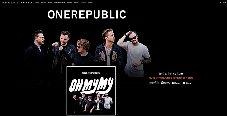


One Republic's website has the dark mystic feel that most alternative rock and indie rock websites have. The background is plain black which is eye caching and draws the attention to the group image. The name of the band is placed in the top of the website in bold which makes it stand out on the page and would also allow the audience to identify straight away what site they are viewing.The album cover is also placed over the image which entices the audience to look at their album and listen to the music that they will like. There is an accent of red text placed below 'The New Album' title which draws the viewers eyes to this text highlighting that it is available everywhere.
The navigation bar is placed in the top left corner of the page.It is small however it does not need to be too big as the website has a roll over effect with the pages being within one page.
The next page allows the audience to identify their new music video 'Lets Hurt Tonight' by making this a statement piece it entices the audience to identify that this band is producing current and edgy music. the background for this page is a bright coral colour this makes the audience more enticed to click on the video as they are more likely to use this is 'click bait' a method of enticing the audience by using the world 'world premiere'
The next page for this website is to do with the news. This page uses images in order to entice the audience click on the different pages. the images used are of the band prfoessionaly which could be a shoot for certain maazines or promotional aspects. there are also images used from cnverts and festivals that One Republic have attended .
There is then a page showing the events that are coming up. the background colour has alternated from the white back to the coral colour which is a way of the band advertising key events. The events are shown as a brief section which is a way fro the viewers to click onto the website and create more page impressions. The page following this is the bands latest release. this is a list of the songs that the view is able to have a preview from. by including this preview it allows the fans to identify whether they like the music and from this they are able to purchase it. The final section of this website is a page which enables the viewer to sign up in order to receive information to do with the latest updates from One Republic. This can include providing an email and a postcode which enables the fans to receive packs of information for each event within the year.